
Top Culture Metrics HR Leaders Want to Measure (and How to Use Them)

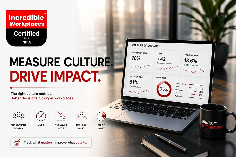
When we brought 20 HR leaders together for our roundtable on measuring culture (you can read the full recap in Top Culture Metrics HR Leaders Want to Measure), one thing became obvious: everyone agreed on which metrics mattered. Almost nobody agreed on how to actually calculate them, benchmark them, or turn them into a number a CFO would sit still for. This piece is the practical follow-up — a working definition, formula, and use-case for each of the metrics HR leaders keep naming.
Why “Measuring Culture” Keeps Stalling at Good Intentions
Most HR teams don't lack data. They lack a small, agreed set of culture metrics for HR that leadership actually trusts and revisits. Instead, dashboards accumulate one-off surveys, a hiring metric here, an engagement score there — rarely built to be compared over time or across teams. The fix isn't more data. It's fewer, better-defined metrics, tracked consistently enough to show a trend rather than a snapshot.
Engagement Scores: What They Actually Capture (and Miss)
An engagement score, typically built from a multi-question survey (belonging, motivation, discretionary effort, intent to stay), is the broadest culture metric most HR teams track — and the easiest to misuse. A single quarterly number tells you almost nothing on its own; what matters is the trend, and the breakdown by team, tenure band, and manager. An engagement score that's flat at the company level can be hiding a 15-point gap between your best and worst-performing teams — and that gap, not the average, is where the actionable insight lives.
eNPS: The One-Question Metric HR Leaders Love (and Misuse)
Employee Net Promoter Score asks one question — “How likely are you to recommend this organisation as a place to work, on a scale of 0–10?” — and calculates the percentage of promoters (9–10) minus the percentage of detractors (0–6). It's popular because it's fast and easy to benchmark. Its weakness is exactly that simplicity: eNPS tells you how people feel, not why. Used well, it's a pulse check that triggers a deeper look — a sudden five-point drop in one team's eNPS is a signal to ask questions, not a diagnosis in itself.
A metric that tells you something is wrong is only useful if it also tells you where to look next.
Turnover Metrics That Go Beyond the Headline Attrition Number
India's national attrition rate is projected to settle around 13.6% in 2026, down from 17.1% the year before, according to Aon's Annual Salary Increase and Turnover Survey — but that single figure hides more than it reveals. E-commerce attrition sits closer to 28.7% and IT services around 25%, while manufacturing and pharma run well below the national average. The basic formula — attrition rate equals the number of employees who left divided by average headcount, multiplied by 100 — is only the starting point; what makes turnover metrics genuinely useful for HR leaders is cutting that number by tenure band, by manager, and by voluntary versus involuntary exits.
Exit interview data deserves more scrutiny than most HR teams give it. Published exit-interview research from AceNgage, covering roughly seven lakh exit conversations, found supervisor behaviour cited as the leading reason for leaving by around a quarter of departing employees when the conversation happened with a neutral third party — well above compensation, which is rarely the primary driver once people feel safe being candid. If your internal exit interviews consistently show compensation as the top reason, that's often a sign of the interview process itself, not the actual cause.
Inclusion Indices: Measuring Belonging, Not Just Headcount Diversity
Diversity counts (representation by gender, tenure, function, level) tell you who is in the room. Inclusion indices try to measure something harder: whether people feel safe speaking up, whether opportunities and recognition are distributed fairly, and whether belonging holds steady across different groups rather than being high on average and low for specific segments. The most useful inclusion metric most HR teams overlook is a simple cut: compare engagement and eNPS scores by demographic group, not just company-wide. A strong overall engagement score sitting on top of a 20-point gap between groups is not a strong culture — it's an average masking a real problem.
This is also where sample size discipline matters more than most HR teams realise. Cutting a 40-person department's survey results into six demographic sub-groups can produce numbers that look alarming but are really just statistical noise from a handful of responses. Inclusion indices are most useful at the organisation level or for genuinely sizeable teams; for smaller groups, qualitative signals — skip-level conversations, focus groups, retention by group over a longer window — are more reliable than a survey score built on eight responses.
PULSE Index: Turning Multiple Metrics Into One Comparable Score
Every metric above answers a different, narrow question. What most HR leaders actually need for a board conversation is one number that rolls several of these signals into a comparable score — which is the specific gap the PULSE Index is built to close. Incredible Workplaces combines a structured leadership audit (30% of the score) with a company-wide employee survey (70% of the score, requiring a minimum response rate to count) across ten PULSE Framework dimensions — including Purpose and Values,
Unified Communication, Leadership, Supportive Environment, Employee Experience and Engagement, and Overall Cultural Health. Because it's the same weighted methodology applied consistently, the PULSE Index gives HR leaders a benchmark that's comparable year over year and across business units, in a way a self-designed internal survey rarely is.
How the weighting plays out in practice
Consider two organisations that both score 68% on their internal engagement survey. One has strong, consistent leadership practices (a high PULSE Audit score) but a lower employee-survey response rate and mixed sentiment on Supportive Environment. The other has excellent employee sentiment but leadership practices that are inconsistently documented and applied. Both might look identical on a single engagement number, but the PULSE Index — by scoring the audit and the survey separately before weighting them — would surface very different priority actions for each: one needs to close gaps in day-to-day support, the other needs to formalise leadership practices that currently rely on individual managers' judgment rather than a consistent standard.
Building a Culture Dashboard That Leaders Actually Look At
A culture dashboard fails for one of two reasons: it has too many metrics for anyone to act on, or it updates so rarely that nobody checks it. The dashboards that survive tend to share three traits.
• Five to seven metrics maximum, each with a clear owner and a defined cadence — not everything the HR team happens to be able to measure.
• At least one leading indicator (engagement, eNPS) alongside a lagging one (turnover), so leaders see problems before they show up in exit data.
• A monthly or quarterly cadence tied to an actual leadership review, not a dashboard that exists but is never discussed in a room with decision-making authority.
A worked example: reading the dashboard together
Say quarterly eNPS drops five points company-wide while overall engagement holds steady. Read in isolation, that's a confusing signal. Read alongside a turnover cut by manager, it might reveal that the drop is concentrated under two managers whose teams show both falling eNPS and rising voluntary exits — while the rest of the organisation is flat or improving. That's the value of a small, connected metrics stack over a long list of disconnected numbers: each metric becomes a cross-check on the others, and the dashboard starts pointing at a specific manager conversation instead of a vague company-wide “culture problem.”
Common Mistakes When Tracking Culture Metrics
• Changing survey questions year to year, which breaks the trend line that makes a metric useful in the first place.
• Reporting a single company-wide average and stopping there, which hides the team-level and manager-level gaps where the real signal lives.
• Running an annual engagement survey with no lighter, more frequent pulse in between — by the time a problem shows up in the annual number, it's often already cost you your best people.
• Treating exit interviews conducted by the departing employee's own manager as reliable data — they rarely are, for the same reason few people give brutally honest feedback to the person still holding their reference.
If you're building your first dashboard from scratch, our earlier guide, How to Run a Culture Diagnostic in 60 Days, walks through the sequencing of a first structured measurement effort.
Putting It Together: A Simple Culture Metrics Stack
You don't need all six categories running from day one. A reasonable starting stack for most Indian HR teams: engagement score and eNPS as your always-on pulse, turnover cut by tenure and manager as your lagging check, an inclusion cut on your existing engagement data (no new survey required), and an annual PULSE Index assessment as the structured, externally benchmarked anchor that ties the rest together. Add metrics as the dashboard proves its worth, not before.
From Sticky Notes to a System
Our roundtable surfaced what HR leaders care about measuring. This is the harder, more useful next question: how to actually measure it, consistently, in a way leadership trusts enough to act on. Culture metrics for HR only earn their place on a dashboard when they change a decision — everything else is just data for its own sake.


Comments